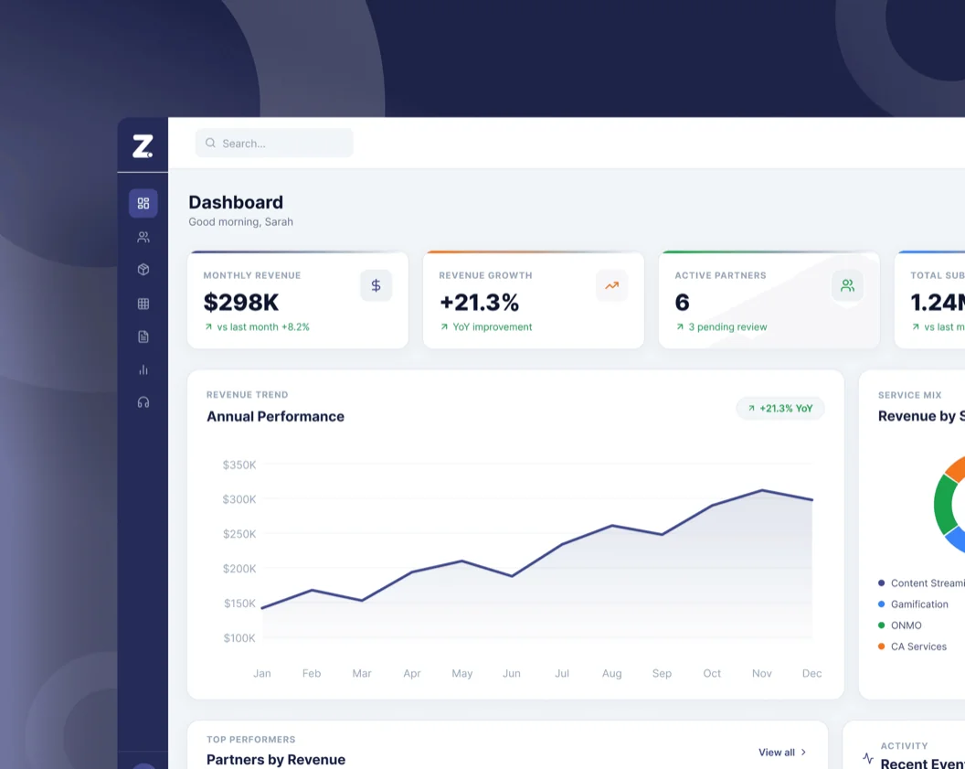
Design System
From fragmented operator builds to one scalable product, a gaming design system built to wear any brand without breaking.
Dec, 2025
- Product
- White-Label Gaming App
- Time Line
- 4 Months
- Role
- Product Designer
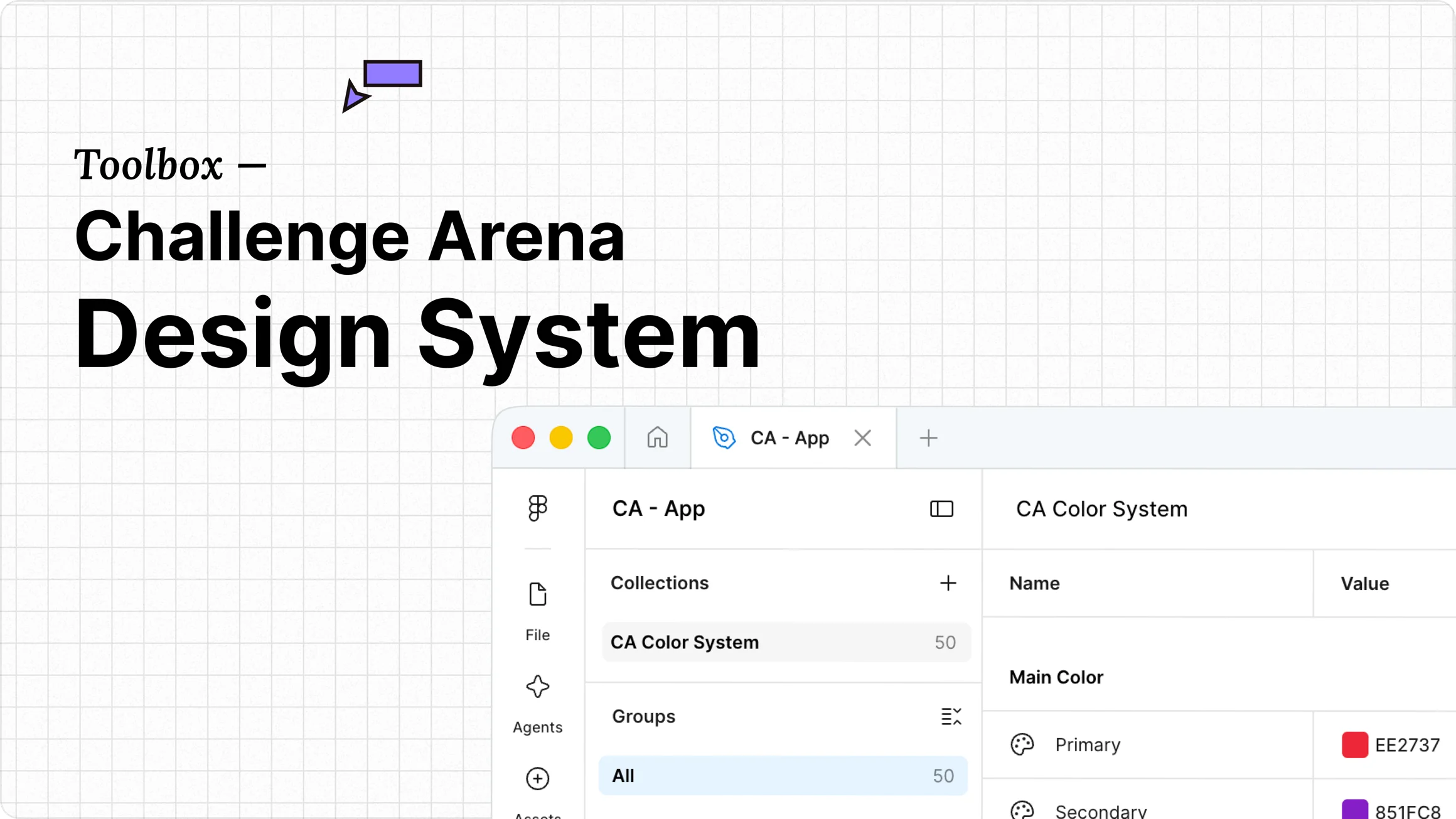
Overview
Built once. Reskinned for every operator.
Challenges Arena ran on a highly customizable model — every operator got different features, different flows, different everything. It worked, until it didn't. The cost of rebuilding for every new client was taxing designers, engineers, and stakeholders alike.
We took a call together
One product, one design, branding customization only. That decision needed a system to back it up one that could wear any brand without touching a single component. That's what I built.
Challenge
Gaming needs patterns that don't exist anywhere.
The domain was too specific for off-the-shelf solutions. Every pattern had to be created from scratch and flexible enough to wear any brand
No Standard Patterns
Gems, player ranks, reward tiers, and live leaderboards - none of this exists in Material Design or standard kits. Every interaction pattern had to be built from scratch.
Must Work for Any Brand
Flexibility couldn't be an afterthought. Every single component had to instantly absorb a major brand swap without breaking layout integrity or requiring a custom build.
System
We built the foundations before we touched a single component.
Before any component was designed, four foundational layers were locked down. These are the decisions everything else inherits — get them wrong and every component downstream breaks.
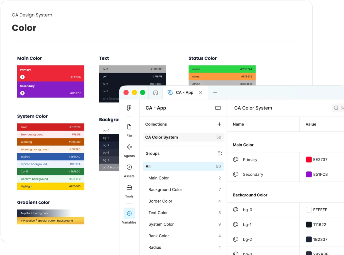
Color
8 categories covering brand, text, background, gradients, system states, status, borders, and rank tiers. Brand colors live as tokens — one swap re-skins the entire product. The rank color system (Golden, Silver, Bronze) was invented specifically for leaderboard hierarchies.
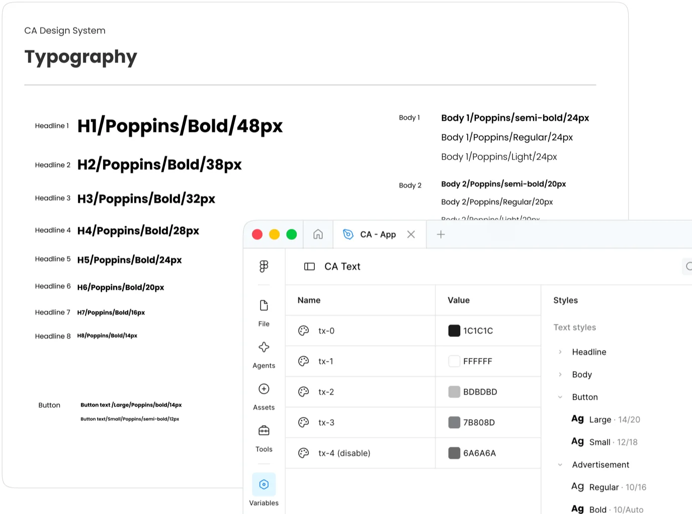
Typography
Poppins across 8 heading levels and 6 body sizes, 3 weights each. Built to feel energetic on a game screen and readable on a data screen same product, very different moments.
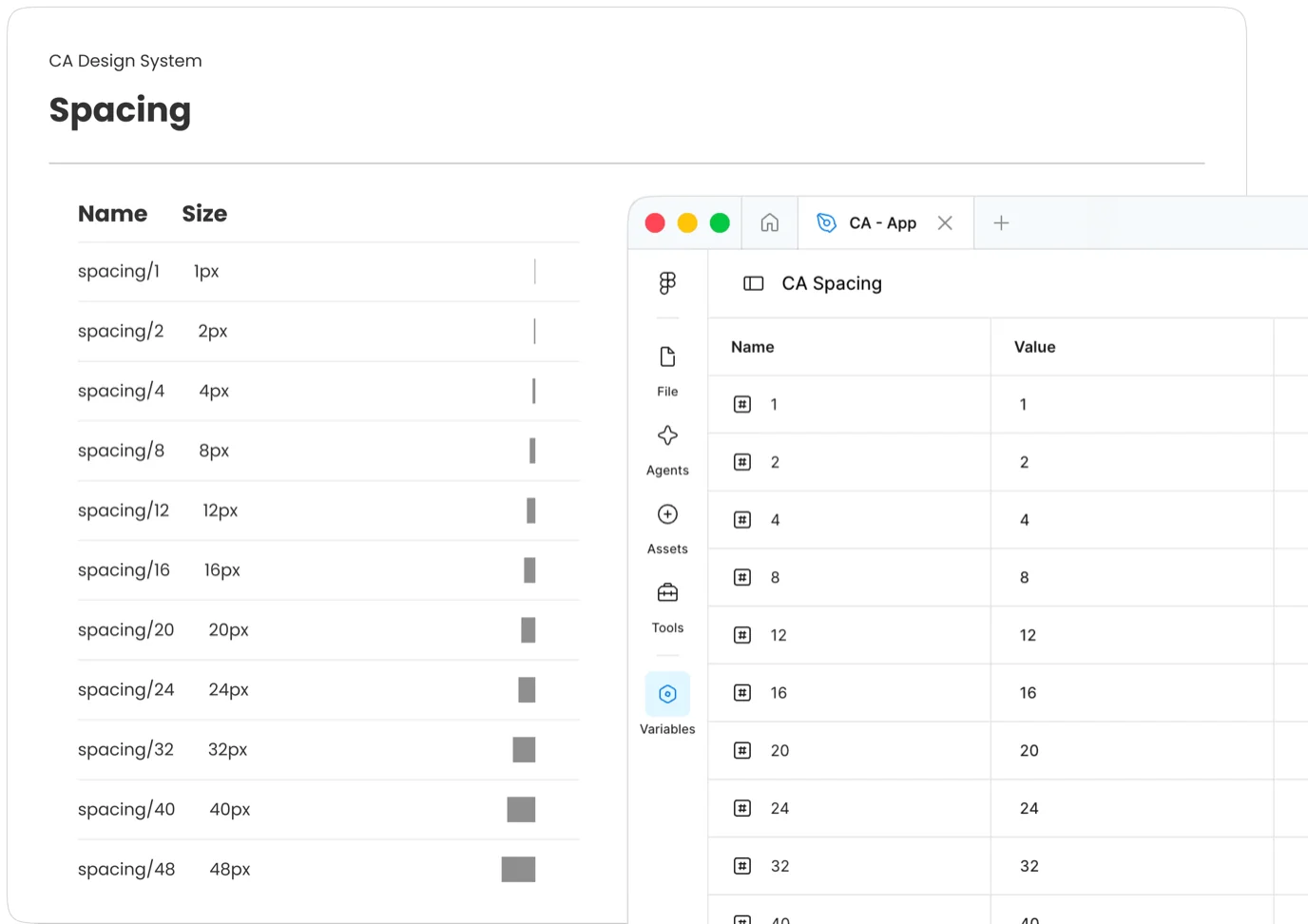
Spacing
Scale from 1px to 48px. Radius tied directly to component size the rule tells you the answer. No guessing, no inconsistency across operators.
Components
30+ button states, 7 list types, 2 progress systems all built to work under any operator skin without touching a single component.
Global Rules
The part no one sees, but everything depends on.
Components are the visible part. The real work was specifying how they behave. In a white-label product deployed across multiple operators in different markets, every undocumented edge case becomes a bug or worse, a consistency failure that breaks the brand promise. So alongside the library, I documented behavior.
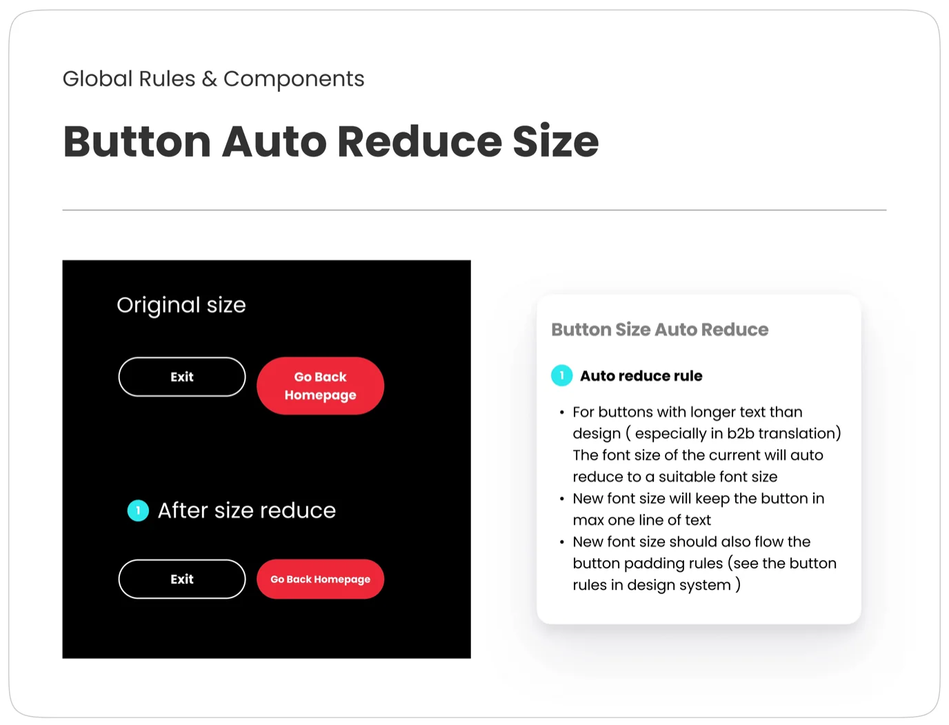
Button Auto Reduce
To handle dynamic B2B text translations that routinely run long across different markets, font sizes automatically scale down while outer padding boundaries stay entirely stable to prevent broken layouts.
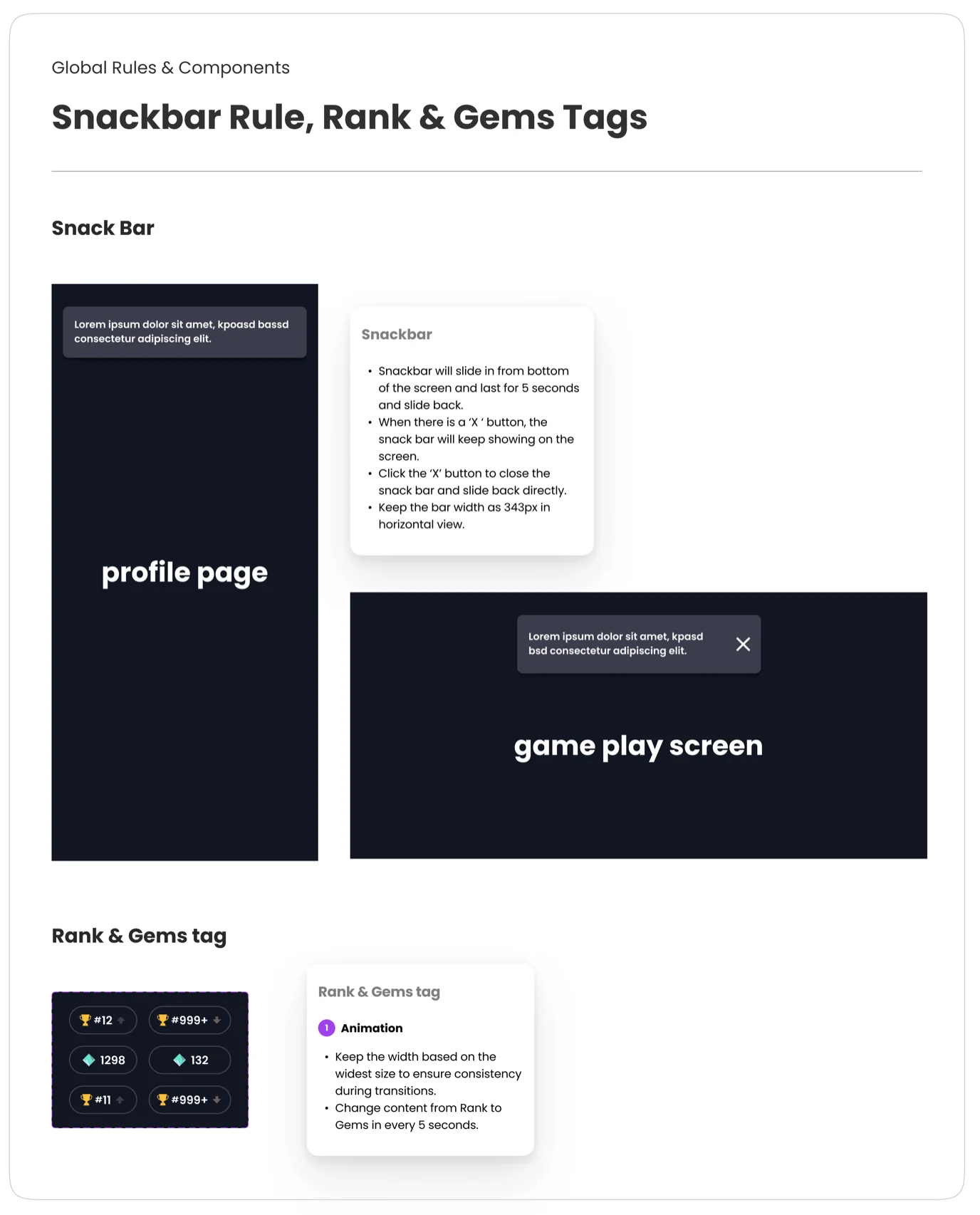
Snackbar & Rank Tags
Established strict animation and spatial physics rules. Snackbars slide from the bottom, fixed at 343px for exactly 5 seconds. Rank tags scale to the widest text string and alternate content every 5 seconds.
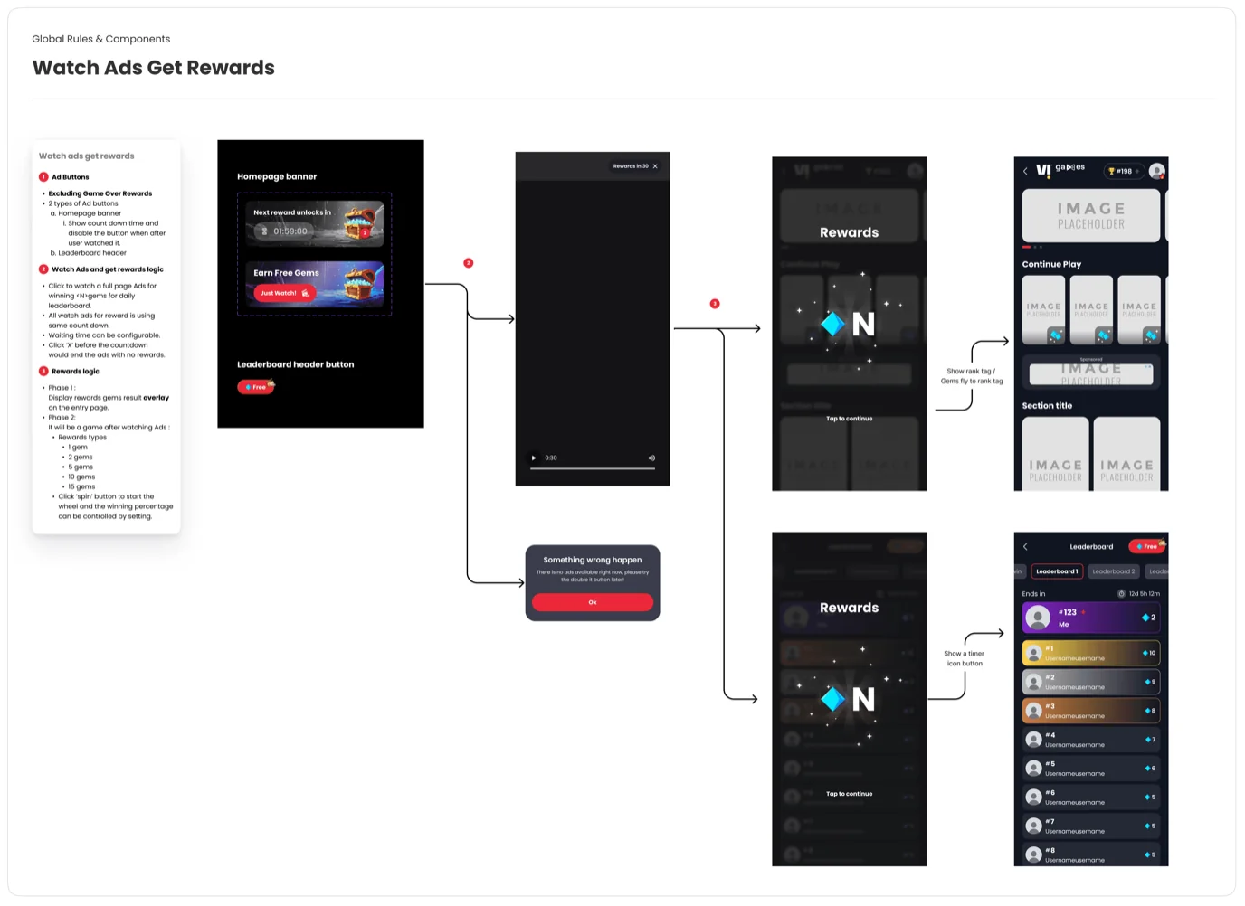
Watch Ads & Rewards
The platform's ad economy used 5 reward tiers, 2 trigger points, and complex error handling. I fully mapped out this entire end-to-end behavioral flow before a single line of code was written to leave zero ambiguity for engineering.
Impact
One swap. Done.
We replaced the dead-end scorecard screen with an automated, instant matchmaking mechanic, allowing players to jump straight into a new head-to-head match with a single tap to keep them in the gaming flow.
Weeks → One Day
From manual design and engineering work per operator to a single token swap.
Zero Rebuilds
Visual content and food photos would be the thing that drove engagement.
Consistent Everywhere
Visual content and food photos would be the thing that drove engagement.